How I improve B2B websites for higher conversions
Author:
Karina
Published:
Dec 5, 2025
Updated:
Jun 11, 2026
Reading Time:
15min
Sometimes, even small changes on the website can improve the results significantly.
For example, one of the companies I worked with was able to achieve these changes in a couple of months after implementing some of the things I will be talking about later.
New users → +5.6% increase
Active users → +6.0% increase
Page views → +10.7% increase
User engagement events → +151% increase
Thank-you page visits → +13.0% increase
You need to understand that website optimization is a complex process, and you cannot improve one thing while completely neglecting others. That is why I strongly recommend paying attention to all of the paragraphs that I will be talking about in this article.
You can tackle them one by one, but make sure to evaluate each one.
Today, I will be talking about improvements and suggestions for B2B websites, but a lot of them can be applicable to the B2C segment as well.
- Header optimization
- Website navigation and structure
- Trust builders
- Variety of valuable offers
- CTA placement strategy
- Contact and conversion paths
- SEO and content strategy
- Analytics and optimization
Header optimization
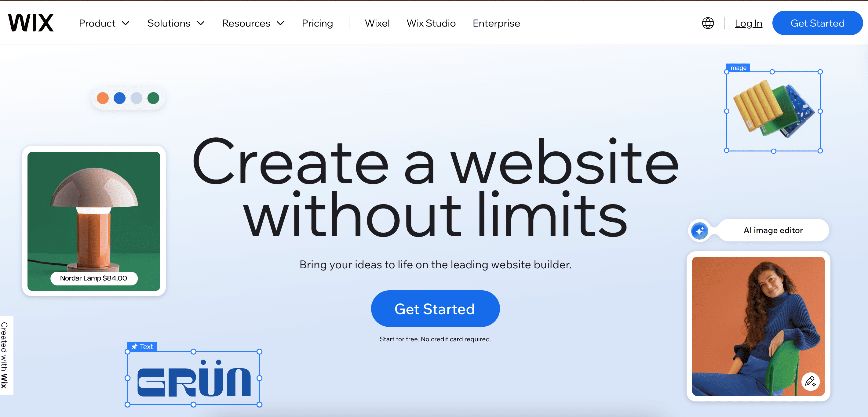
It will come as no surprise to you if I say that your headers should have a clear value proposition and be easy to read. Website visitors should be able to understand what you offer in 3 seconds.
Highlight the benefits you offer directly in the header and provide more specific details and clarification in the subheading. The subheadline should include your industry, the problem that you are solving, and the solution that you are providing.
Right after the main heading, locate a CTA button that will encourage people to take an action. It might be a demo, consultation, or pricing information.
Examples:
Why it’s good:
The main header tells you about the impact right away. You understand from a single sentence how this website will help you. The subheading reveals what exactly this place is, what kind of topics you can expect to see here, and for whom this place is.
The CTA button is placed in a visible place after the subheading.
Why it’s good:
Clear message. It is very simple and understandable. The CTA button encourages you to take action.
Notice that below the CTA button, there is text that tells you more about the offer, saying that you can start for free and no credit card is needed. That increases the chances of conversion.
The website design here is also worth mentioning; it's eye-catching and visually engaging.
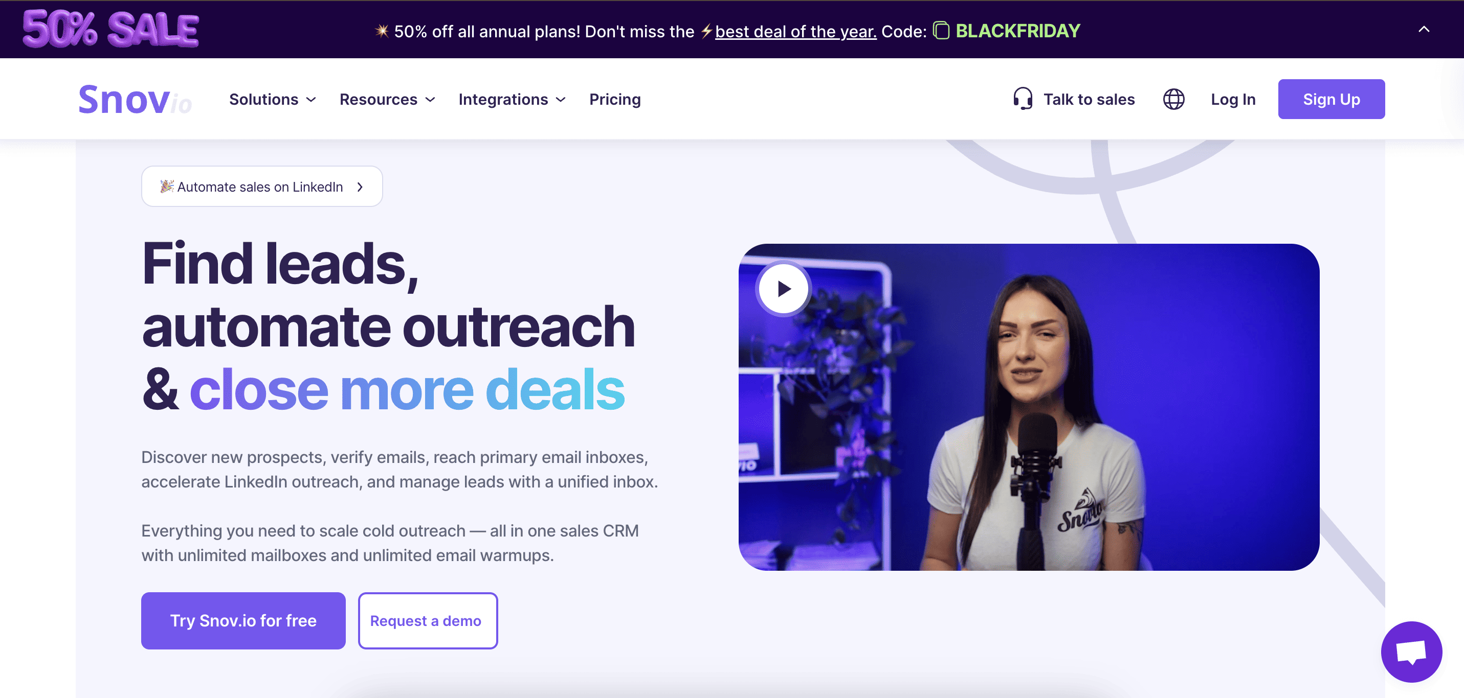
Why it’s good:
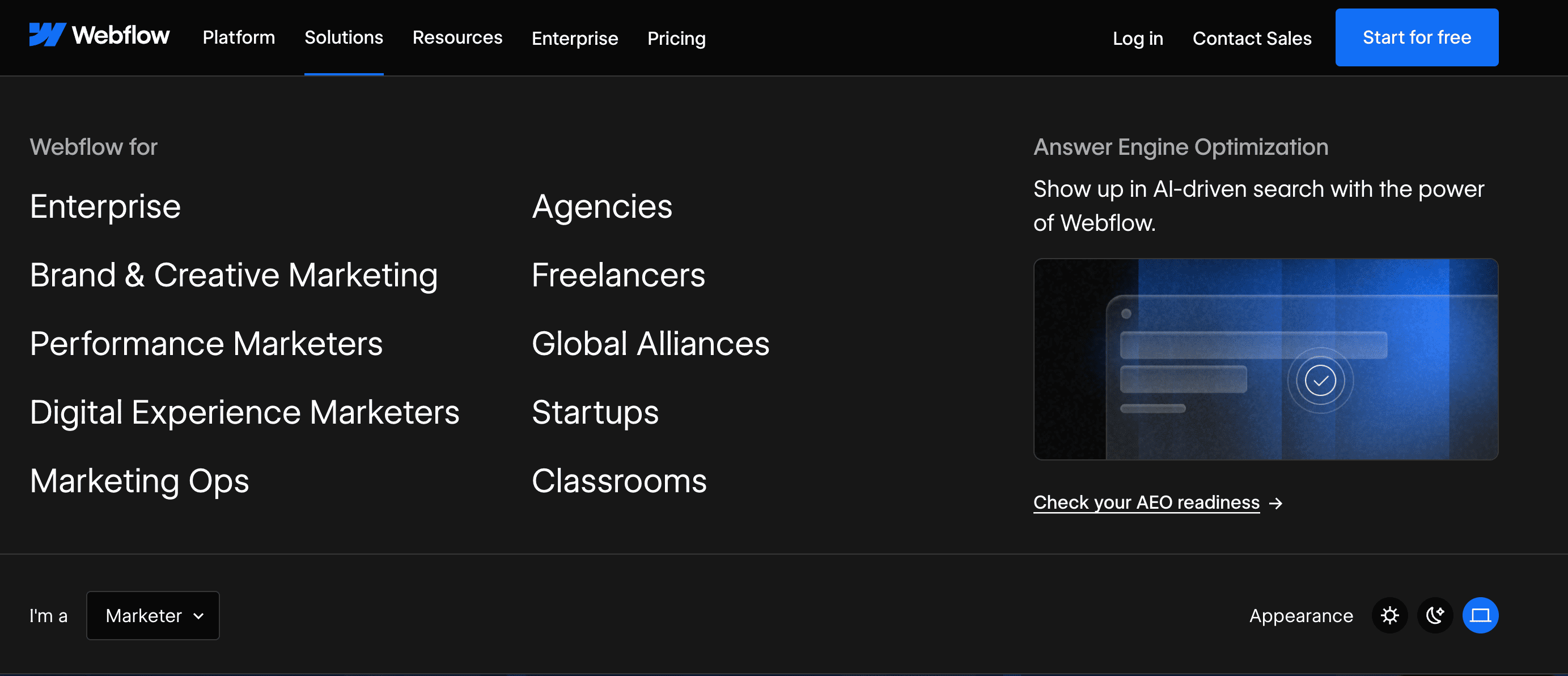
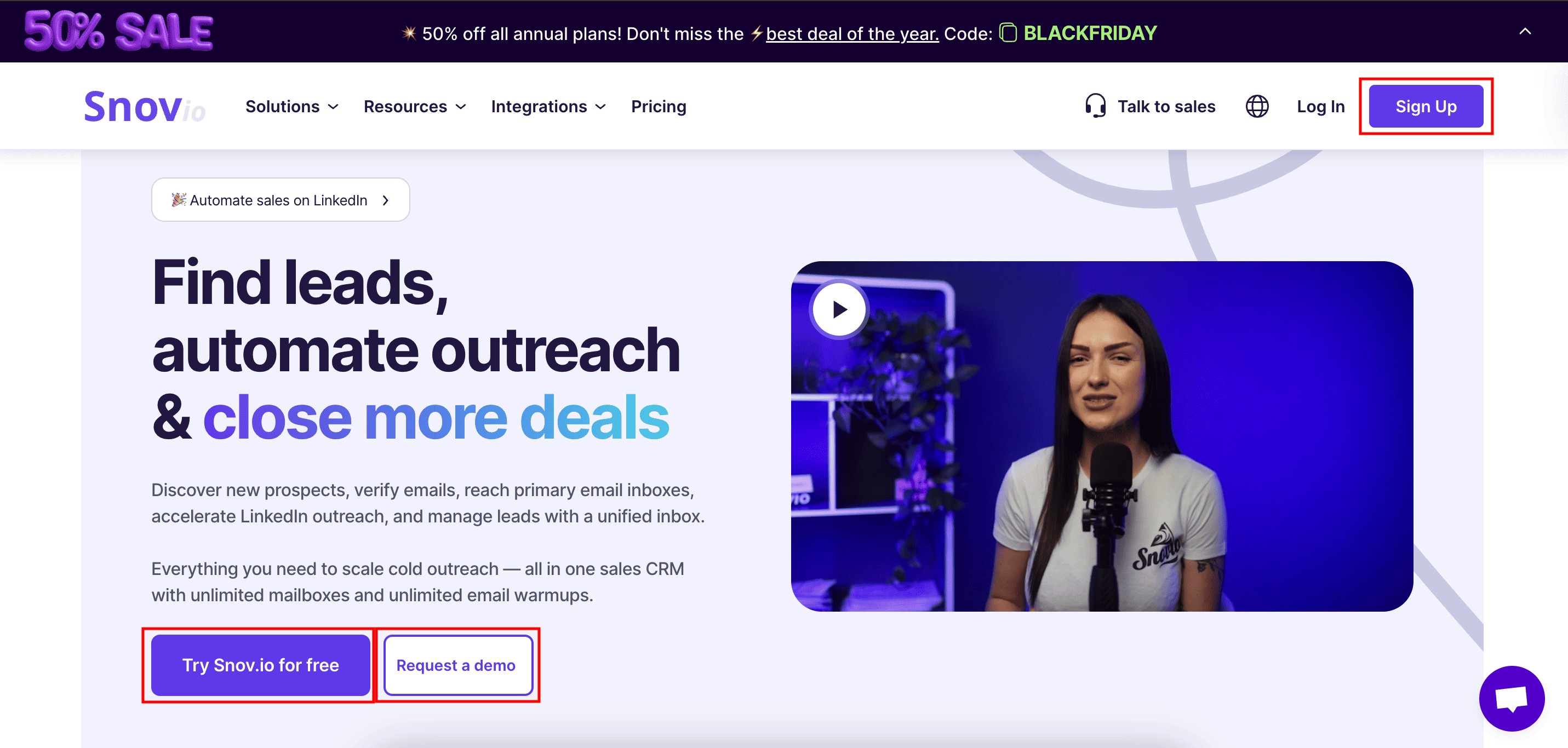
Snov.io is a platform for B2B companies that helps with lead generation through outreach and email marketing.
You can find everything you need on their landing page. It has a clear message, product impact, and explanation. You can try the product for free or watch their demo. They also have a great Black Friday offer at the top of the page.
I also like their engaging video that shares more specifics about the platform. It helps to increase the time people spend on the page and the overall user engagement.
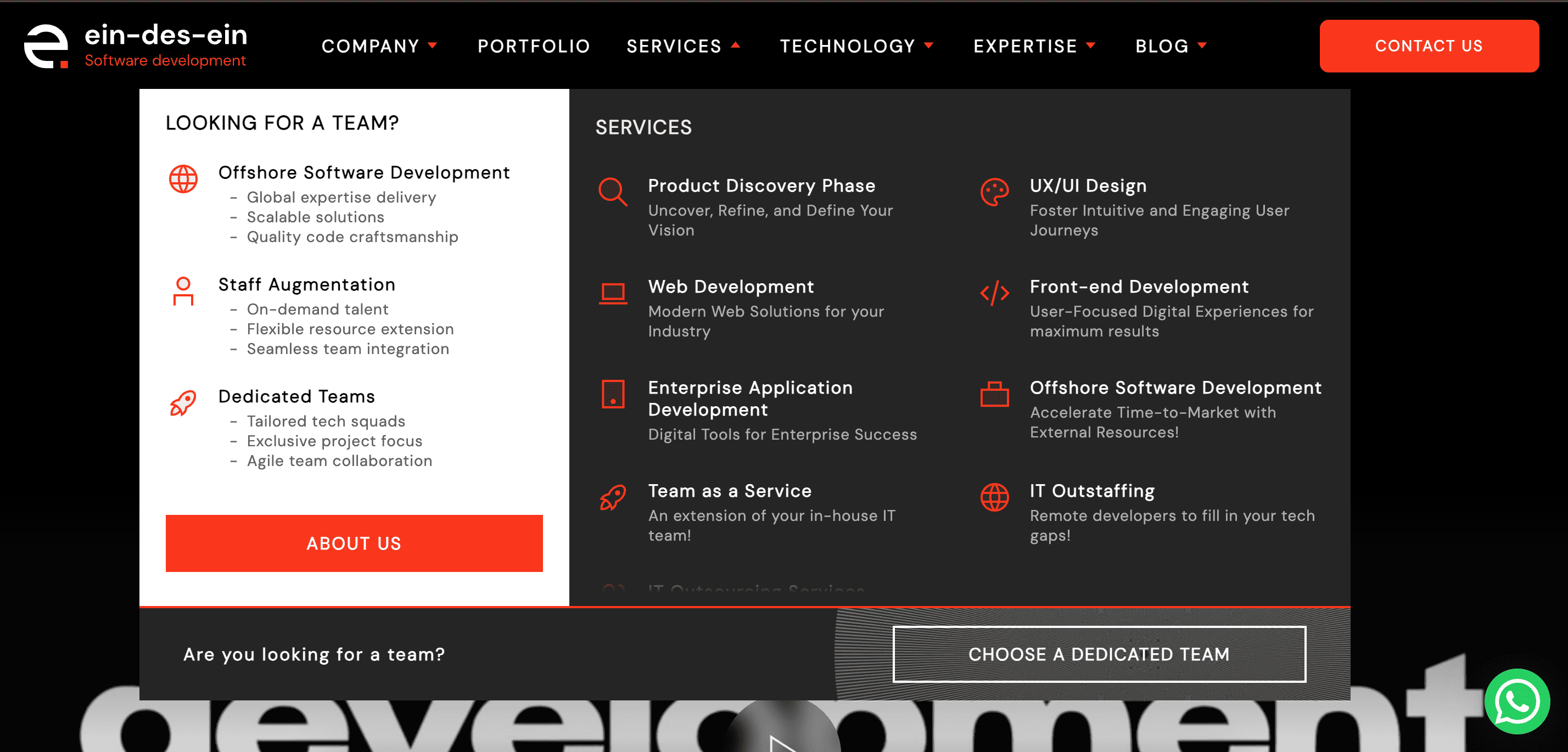
Website navigation and structure
Your website visitors should be able to navigate the website without a map 😂. How do you achieve that?
Here are a couple of tips to follow:
→ Use clear page segmentation (blog, industries, services, solutions)
→ The navigation menu should be simple and clean. Make sure it’s located in the header and always accessible.
→ Make sure the users can easily come back to where they started.
→ Have a sticky header that does not change across the pages.
Try to think of the best way to provide your visitors with the best user experience possible.
Examples:
Why it’s good:
This is a great example of a B2B website design.
Services are attached to the header and can be checked at any time. They are also divided into two main sections for clearance. You can read more about every service by clicking on it.
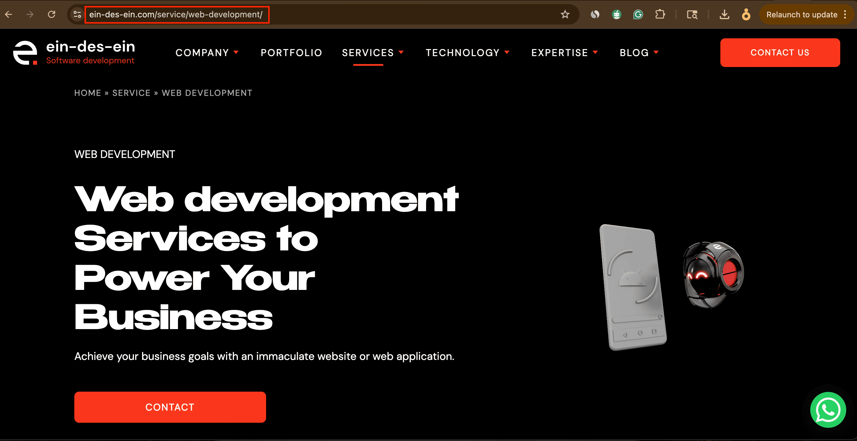
Let’s pay attention to the URL here. It has a very clear page path: Main page → Service → Actual Service. You should try to follow the same logic.
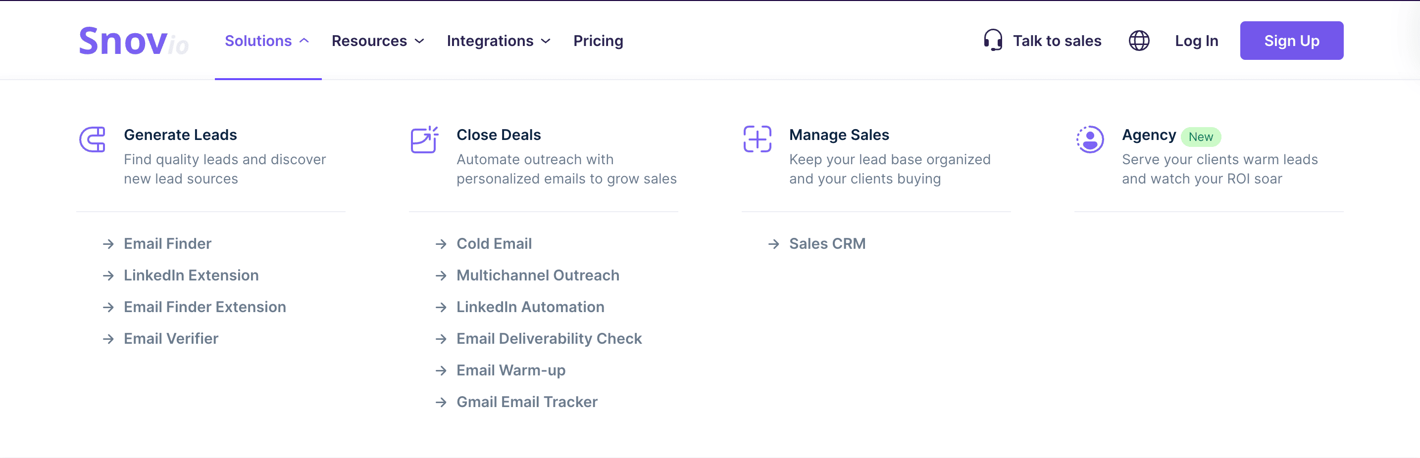
Why it’s good:
Solutions here are divided by action for easier navigation and better user experience. It is basically saying that if you want to generate leads, you can use this list of our features. Everything is straightforward.
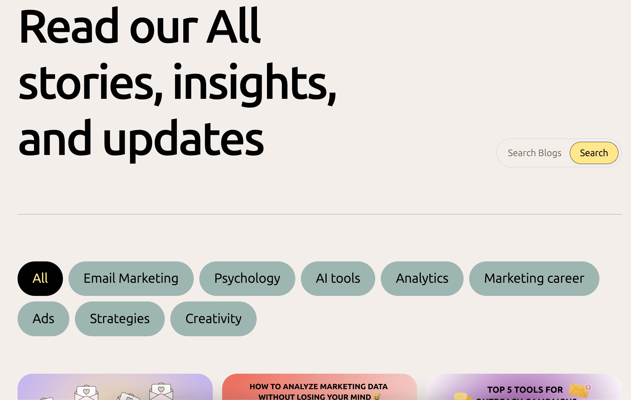
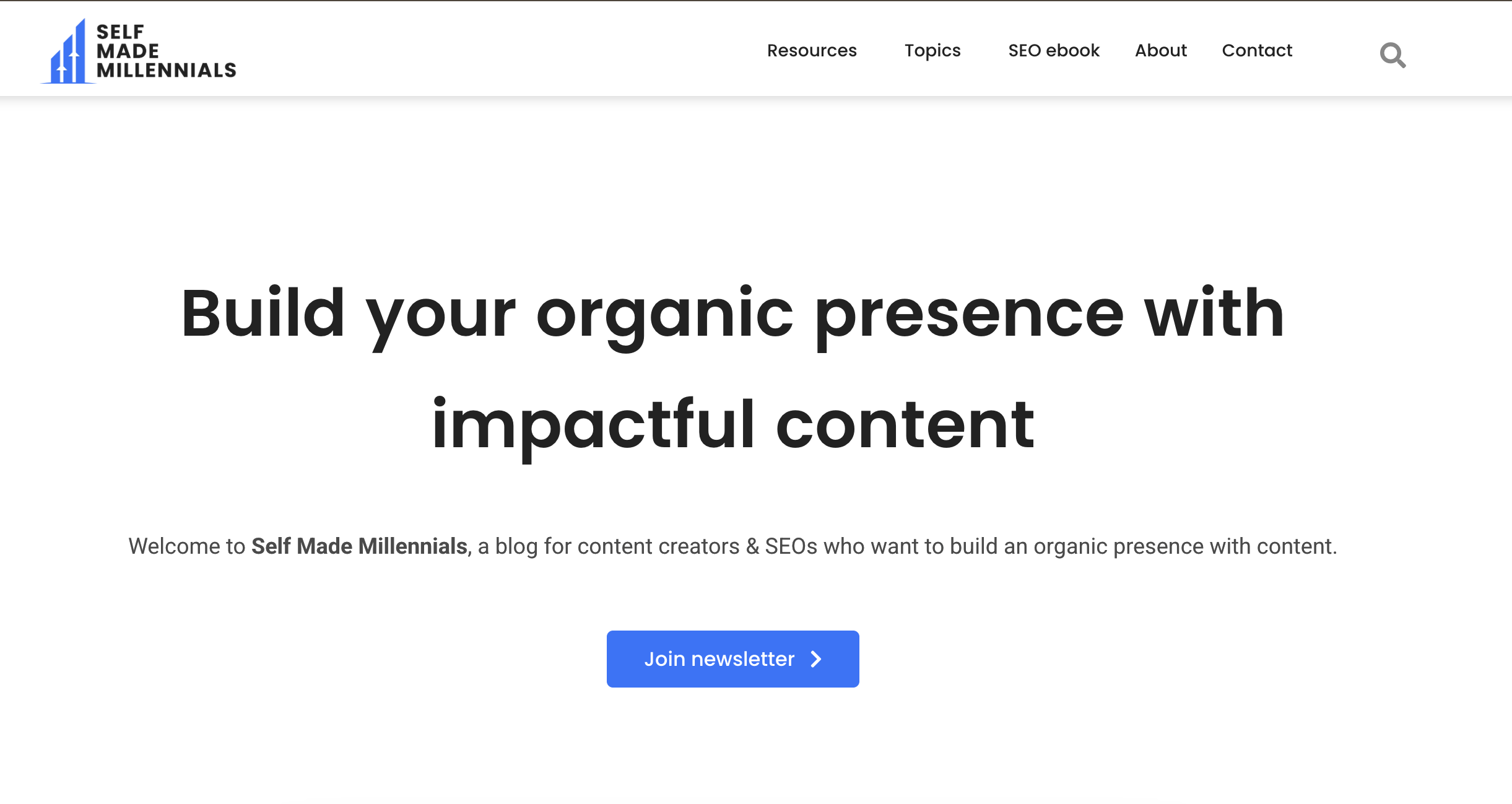
Why it’s good:
If you have a blog page, you should try to break down all articles by categories for users' easier navigation. That is something that I implemented myself.
Besides the main categories, I also have a search bar that will find all the matching words in different articles if you are looking for something very specific. In that case, you can even read a little bit of context to better understand what the article is about.
I believe that improves user experience significantly.
Trust builders
You can build trust in your products or services for your B2B buyers in different ways. It can be team introductions, case studies with real numeric results, and reviews from real people and companies.
You can use one or combine several options at the same time. You just need to give your customers social proof.
The advice that I could give you here is to try to reverse the roles and imagine yourself as a potential customer.
- What kind of social proof would you like to see?
- What would make you trust the company?
- What indicators can tell you that their products/services are worth the money?
After you answer these questions, try to implement that on your B2B website.
Examples:
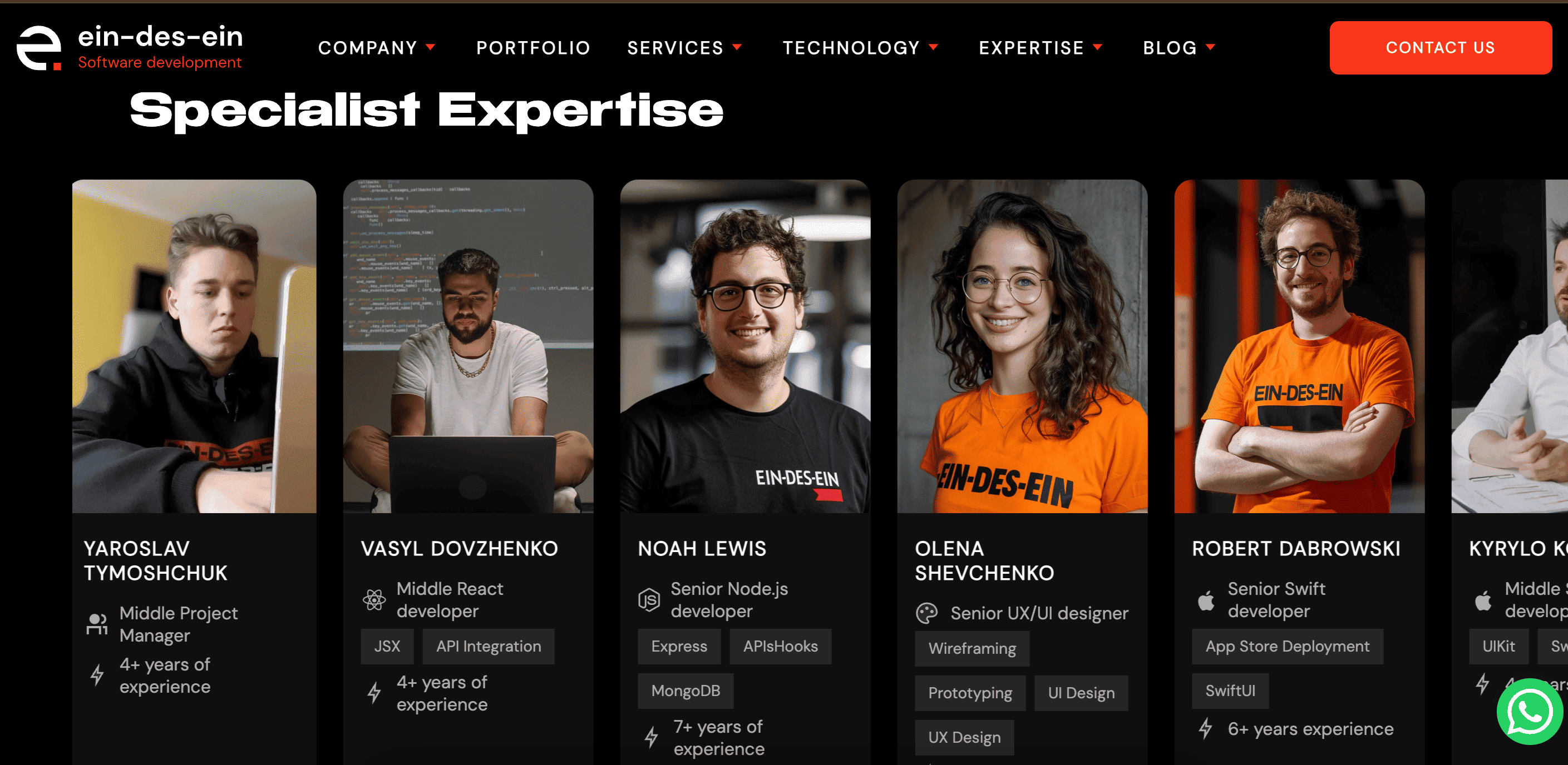
Why it’s good:
This is a great example of a team introduction. Visitors can not only see the people they might potentially work with but also their expertise and years of experience, which definitely builds credibility.
This block is also moving, and I can tell you that it attracts a lot of attention.
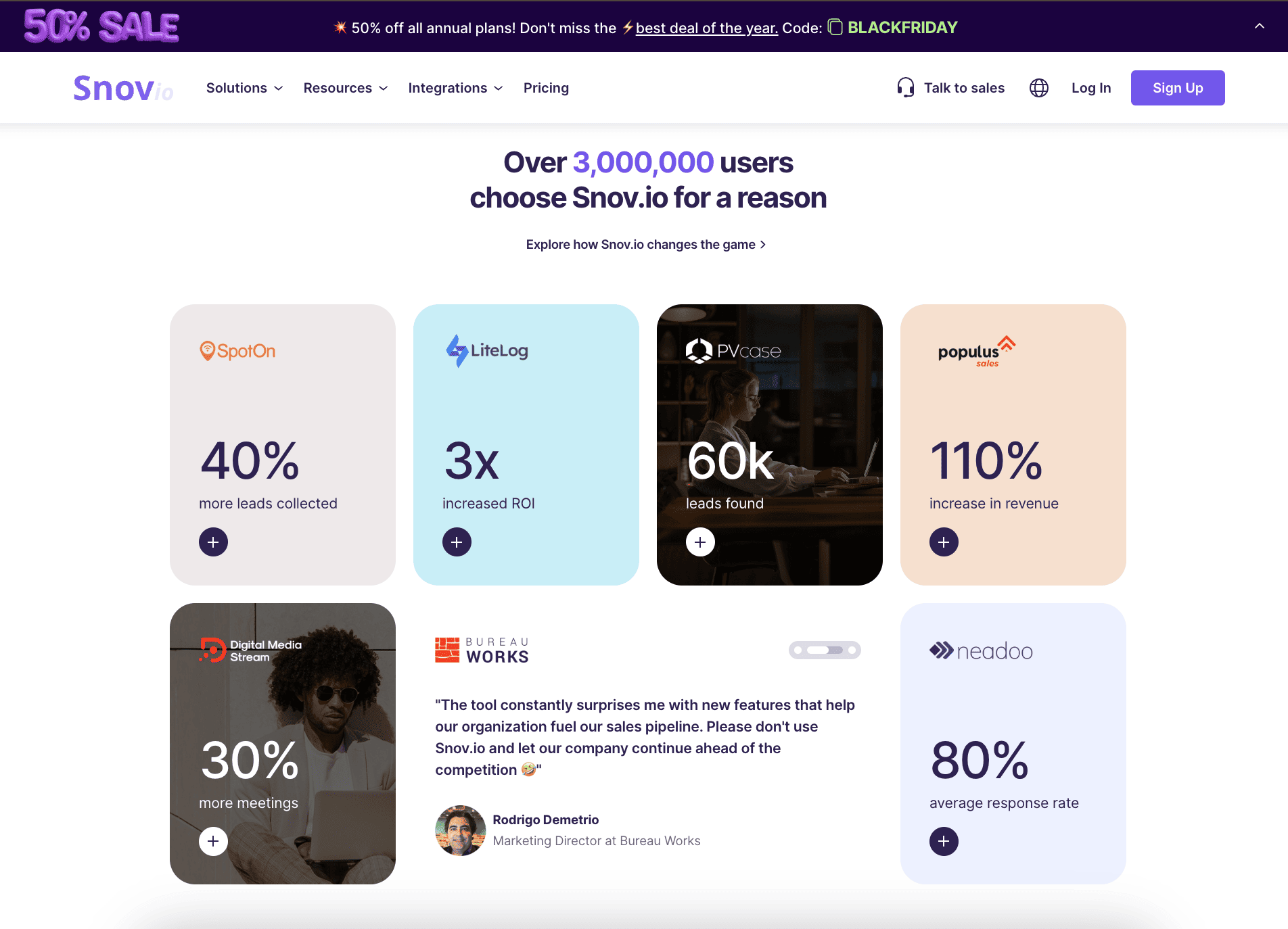
Why it’s good:
This is a good representation of how to showcase case studies and reviews. You can read more if you click on the icon. Those are case studies with clear numbers and important metrics. This is exactly what potential clients are looking for.
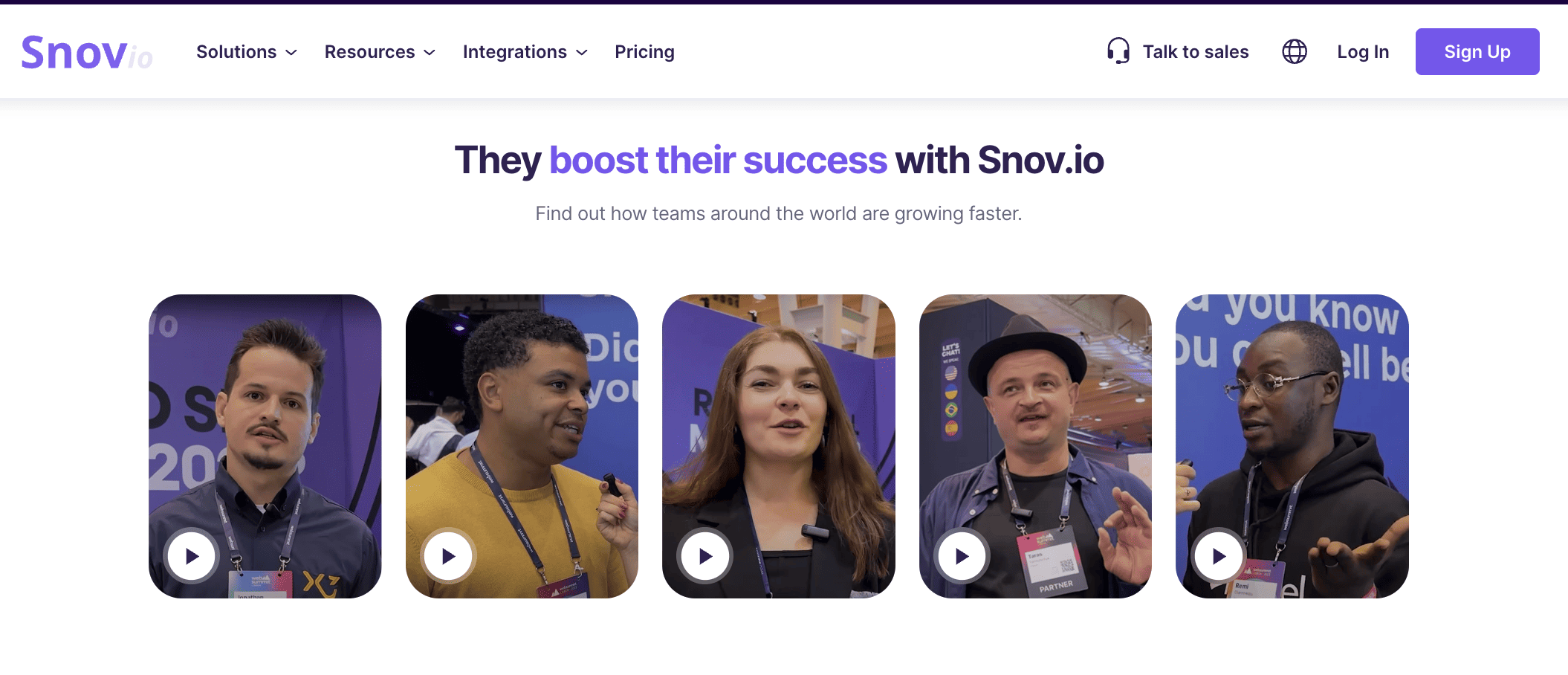
Why it’s good:
Snov.oi also has video testimonials from different companies that share how they benefited from using their platform. I know it might seem hard to collect those kinds of reviews, but I think it’s definitely worth the effort.
Variety of valuable offers
What exactly does "a variety of valuable offers" mean? That means that you should have offers in different price segments and various categories that could potentially serve a variety of people.
I understand that it is not always possible to provide many products and/or services simultaneously, but you should try your best to catch as many different audiences as possible.
Examples:
Why it’s good:
Here is an idea of how the same product could be represented for different audiences. Webflow is a platform for website creation (I use it myself). What they offer is a subscription to their platform, where you can create your own website.
It is the same product for all of these different audiences, but they did a smart thing by differentiating them from each other. In that way, a freelancer, an agency owner, or a startup founder can be sure that their needs and expectations will be met.
That means that Webslof has a value proposition for all of those audiences.
Why it’s good:
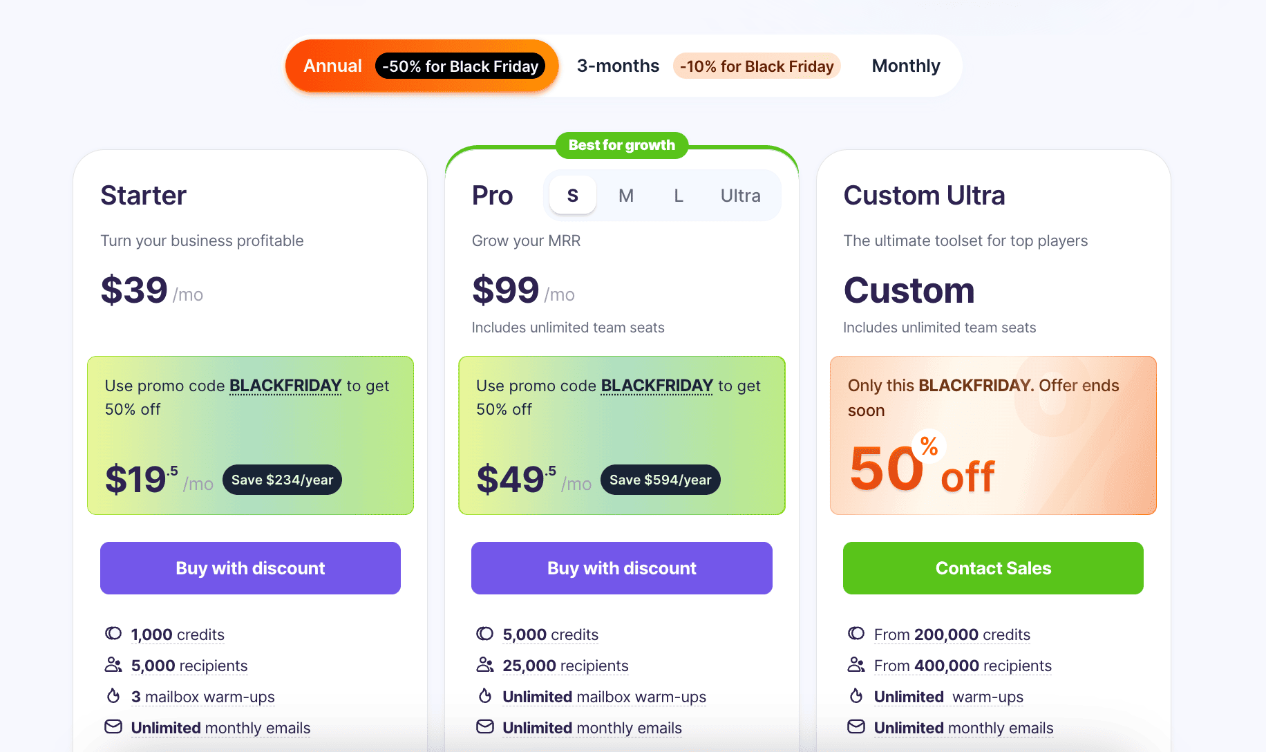
If you are a SaaS company, you might consider these pricing offers. As you can see, the pricing is broken down by annual, 3-month, and monthly, and additionally by Starter, Pro, and Custom plans.
That way, you can choose how often you want to pay and how much functionality you need.
Why it’s good:
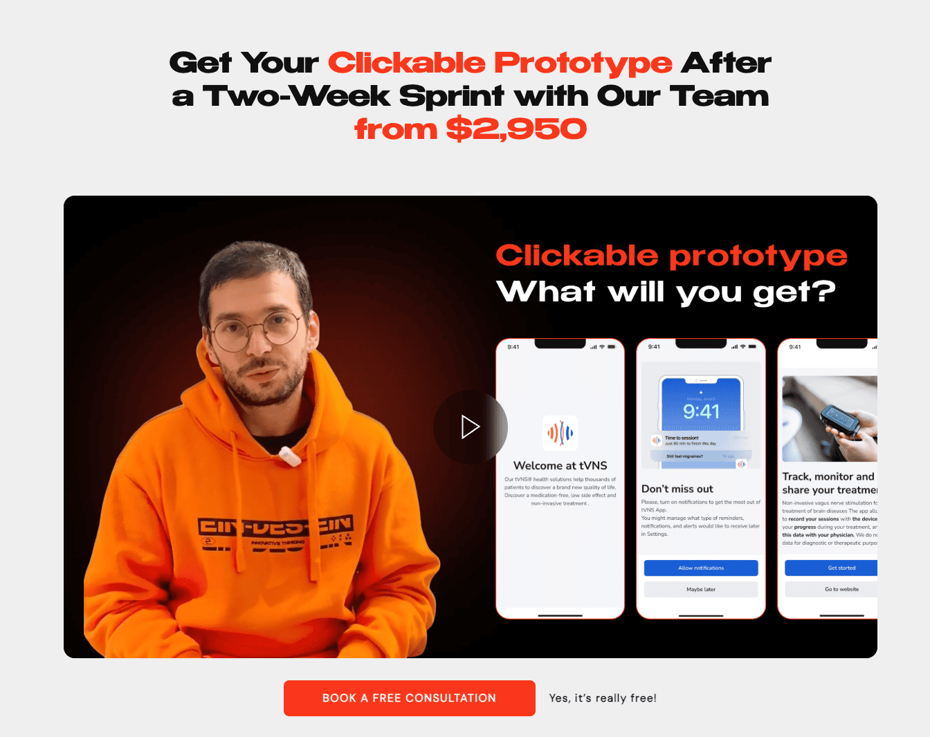
These guys offer a clickable app prototype after 2 weeks of working with them, which is damn impressive.
As you can see, they also have a video where they explain what you will get in more detail and encourage you to book a free consultation, which is almost stress-free.
This is a small and easy offer, something you will most likely agree on much more easily compared to a $50K 6-month app development contract.
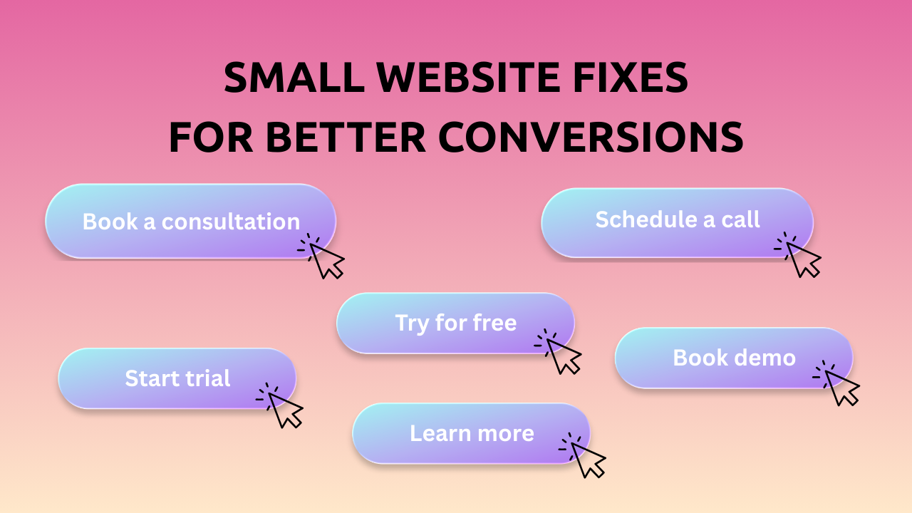
CTA placement strategy
I called this block a call to action placement strategy, because there should be a strategy 😂. You need to understand why you placed your calls to action where you placed them and how well they will serve you.
CTA should not only be located in the right places but also be relevant to the block where they are placed.
Here are a couple of ideas:
- Above the fold → Try for free, book a demo, get a free consultation, etc.
- After benefits → Explore how we can benefit you, collect your benefits, etc.
- After case studies → Learn more, read more, explore all, etc.
- In the footer → Contact our team, book a free consultation, etc.
- On sticky header → Contact us, sign up, subscribe, etc.
- On blog pages (soft CTAs) → Read more, explore how we could help you, etc.
You can also try testing different calls to action for different landing pages.
Examples:
Why it’s good:
I know I showed you this screenshot before, but let’s take a closer look at the CTA buttons here. In the header, you have a sign-up button for those who are already using the platform.
At the bottom, you have the "try for free" and "request a demo" buttons. It’s basically all the interactions you need to have with this platform.
Why it’s good:
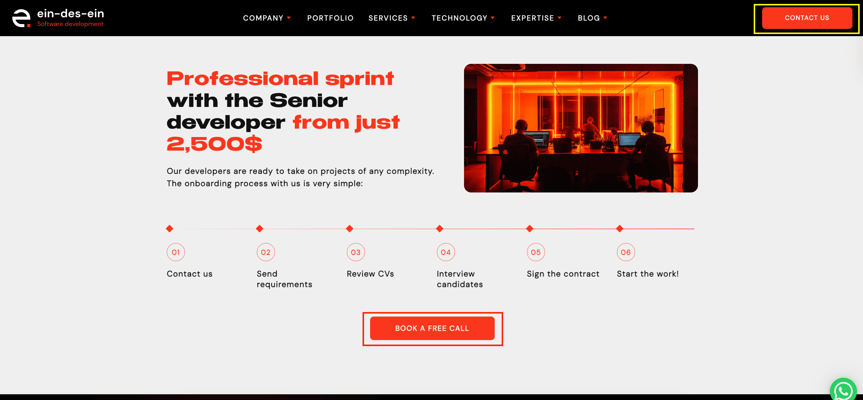
As you can see here, they have a block with an offer and a call to action to book a free call. At the top of the page, there's a “contact us” button, which leads to the same page, but it’s always good to have multiple options to test which one performs better.
Why it’s good:
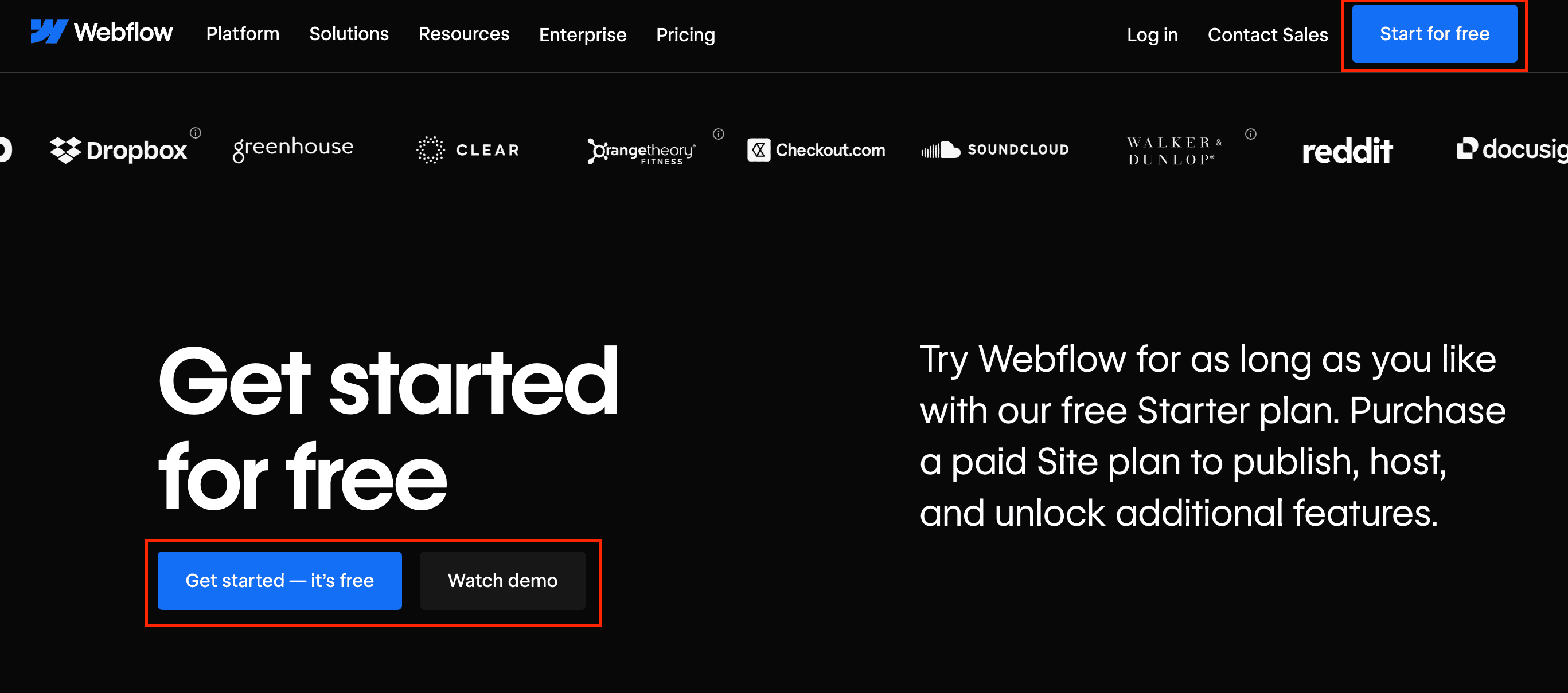
This is a Webflow blog page. At the bottom of the page, there are two buttons that encourage you to try for free and watch a demo. There is a similar button in the heading. Again, it’s always good to have multiple buttons. One of them should always be static and remain on the page all the time.
Another thing that I like about this whole block is that it gives a simple explanation of how the platform works and when exactly you would need to start paying.
That makes the customer experience smoother.
Contact and conversion paths
If you run a B2B website, the action to contact you should be as effortless as possible for your potential customer. Try to think of the most convenient way to contact you.
That can be:
→ Google form
→ Via email (the visitor leaves his email, and you contact him the same day)
→ Booking through the calendar, where the visitors can pick the time that suits them the most
→ A chatbot that will answer all the questions and send the info to a human
→ Social media link, etc.
You can also create different interactive tools (if relevant) to make people stay longer on the website and convert faster. It can be an ROI calculator, a price estimator, a color palette collector (to help people with ideas for design), etc.
It can literally be anything; you just need to brainstorm the idea a bit.
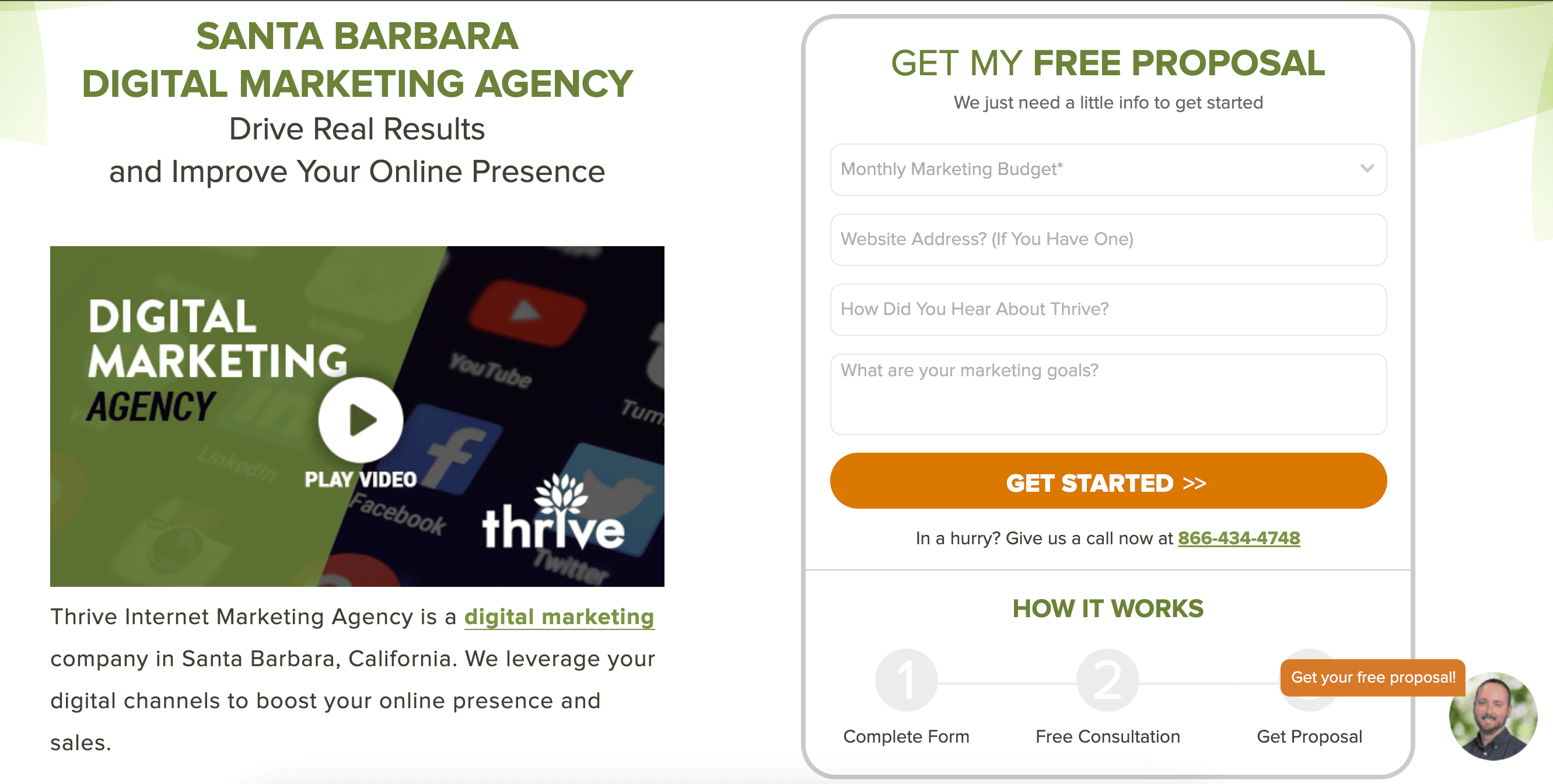
Why it’s good:
It is a simple form that explains a step-by-step process, and it doesn’t take a lot of time to complete. If you offer any kind of services, you might consider something like this.
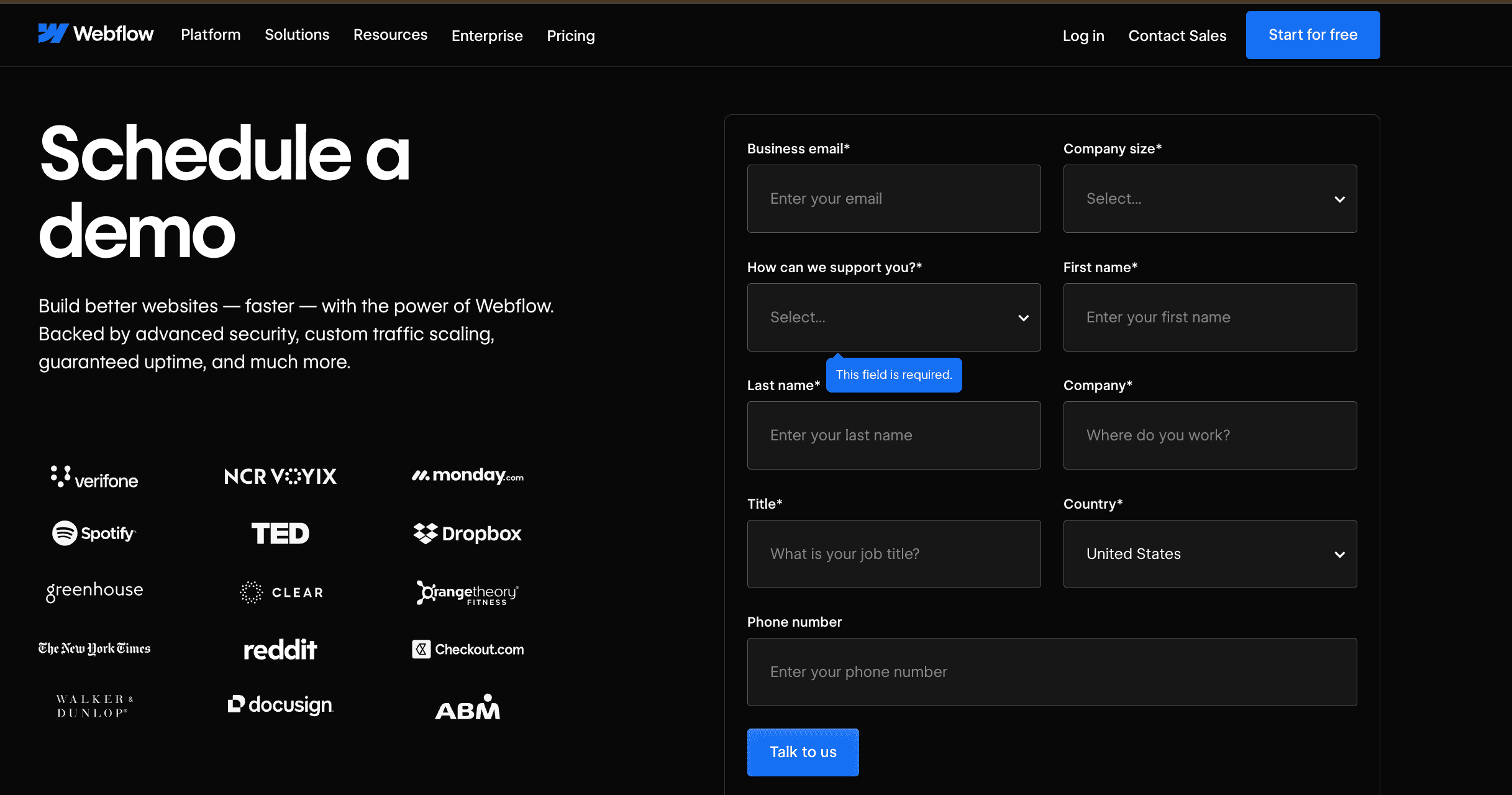
Why it’s good:
This is a simple form for scheduling a demo with a lot of drop-down menu options, which are fast to fill in. That creates a smooth user experience. I also like that they added logos of the well-known companies that use the Webflow platform to build trust.
SEO and content strategy
Of course, on top of all the things that we discussed earlier, you should also optimize your website for SEO to get leads organically and increase the overall traffic on the website.
Some of the things to follow:
→ Optimize service pages and product pages by adding relevant keywords and explaining the services in informative language
→ Create blog posts with actual insight and interesting content (feels obvious, but still worth reminding)
→ Create a content management strategy and follow it
→ Make sure you have internal linking between your website pages
→ Have a clear pillar + cluster structure to build topic authority around topics relevant for your website
→ Pay attention to metadata, which includes titles, correct heading types (H1, H2, H3), meta descriptions for images, URL structure, etc.
Don't neglect the website design, user interface, and customer journey. It all comes together.
If you want to know more specifics about that topic, you can read a search engine optimization expert's article on that matter.
Analytics and optimization
I hope it goes without saying that you need to constantly analyze and improve. Set up analytic platforms like GA4, GTM, Search Console, and Heatmap, and check them regularly.
Pay attention to what keywords have the most impressions but don’t have any clicks, and think about why this might be happening. Check how far people scroll your pages and what to implement to keep them more engaged and interested.
A/B testing will be your best friend here.
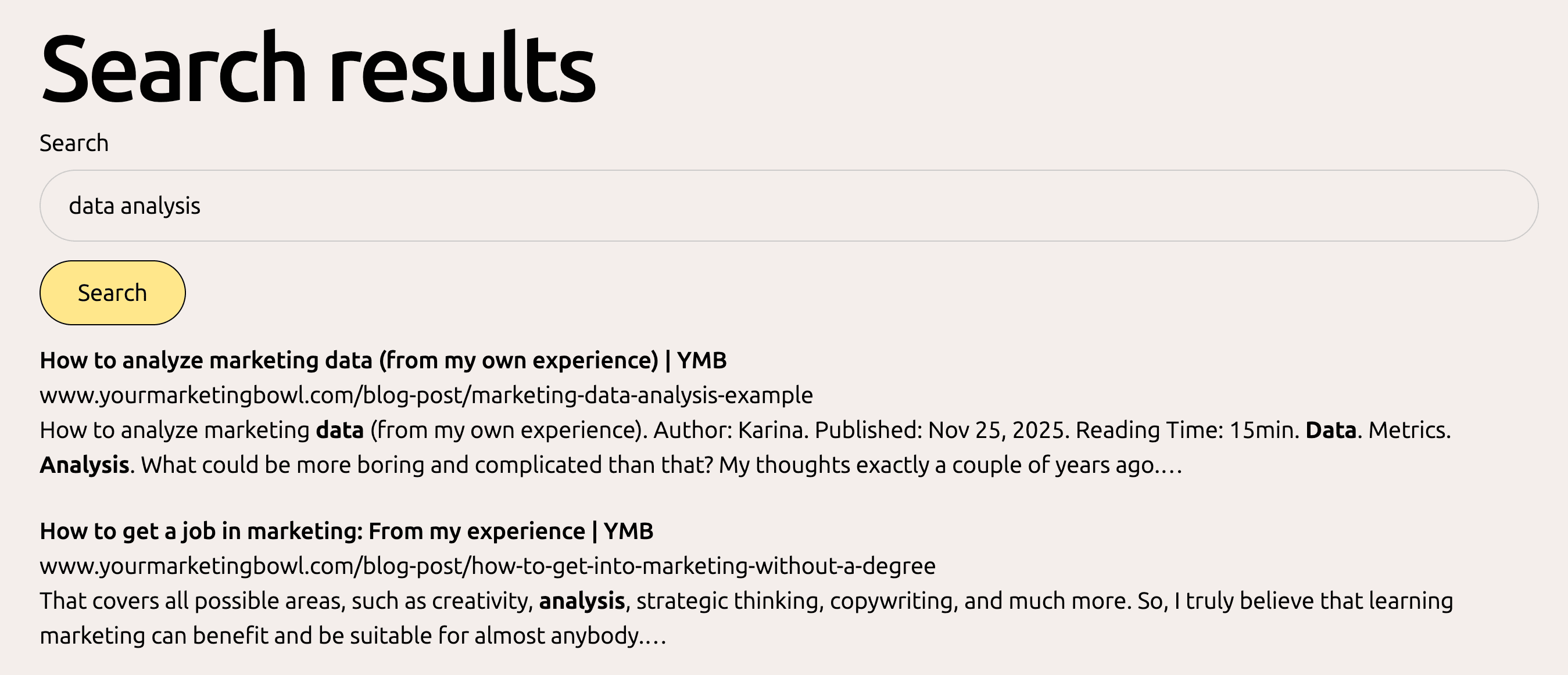
It is a constant process of trying, failing, analyzing, and optimizing, and it repeats again and again. If you want to know more about data analysis, I have a whole separate article about it.
That’s all for today. I hope this will help you to improve your CRO and compete with other B2B companies :).
Disclosure: Some links in this article may be affiliate links. If you choose to make a purchase through them, Your Marketing Bowl may earn a commission at no extra cost to you.
The content on this site is for informational and entertainment purposes only and should not be taken as financial advice. For full details, see the disclaimers section.
The content on this site is for informational and entertainment purposes only and should not be taken as financial advice. For full details, see the disclaimers section.

Hey there! I'm Karina! I love marketing and everything about it. I've been working in marketing in Eastern Europe, Sweden, and now in Santa Barbara, CA. I hope you gonna like it here.

Subscribe for marketing advice
I'd actually give a friend
Join our mailing list and never miss a story.
No AI, no BS!